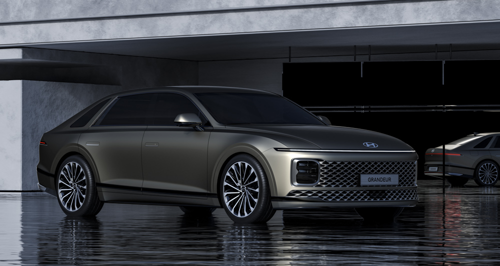
During the Hyundai Motor Company’s early years, the firm relied on partnerships with established brands to come up with the initial models. In the late ’60s, the Korean carmaker worked with the Ford Motor Company to release its first-ever model. And while it did try coming up with its original vehicles early on, Its longtime partnership with the Japanese brand Mitsubishi helped bring Hyundai into relevance.
In the mid-’80s, Hyundai launched its first luxury model, the Grandeur. This was just a rebadged Mitsubishi Debonair—a result of its cooperation with the Japanese company. But much has happened since then.
And Hyundai is done with rebadging cars from other brands. Now, the manufacturer has become a serious competitor in the automotive industry. And as it already enjoys worldwide success, Hyundai previews a new model. One that is a nod to its roots: the all-new Grandeur.
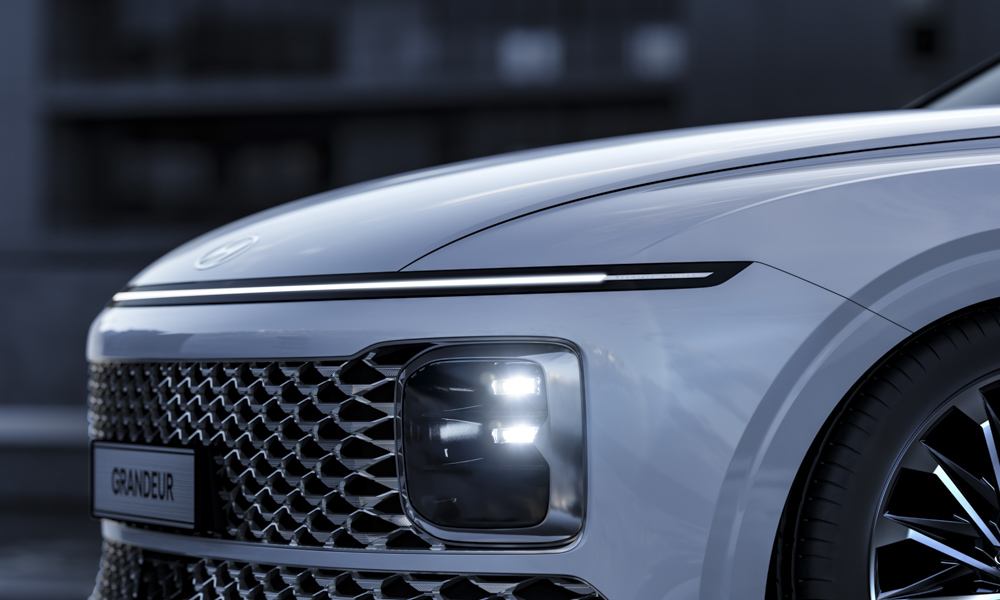
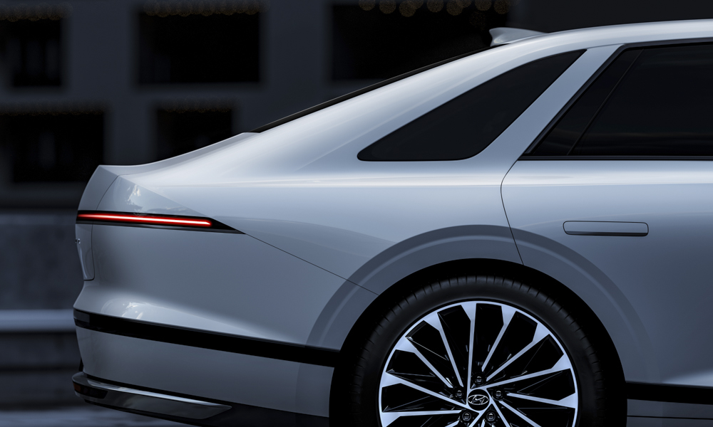
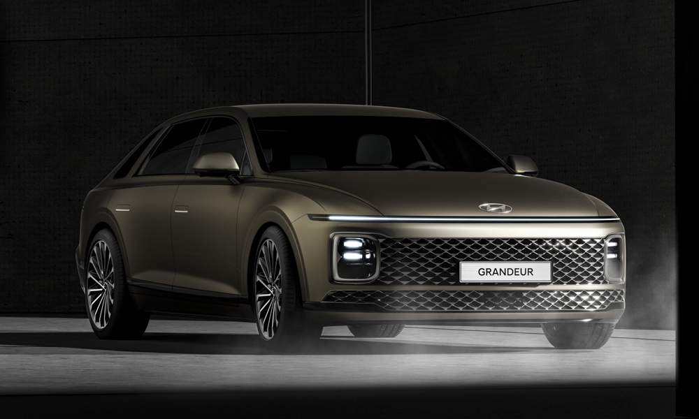
The latest Grandeur, called the Azera elsewhere, continues to be the flagship model. Hyundai went all out and pulled the cards from its hat full of design ideas. Take the front clip, for example. It features the brand’s new corporate look.
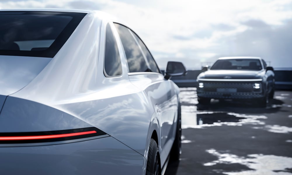
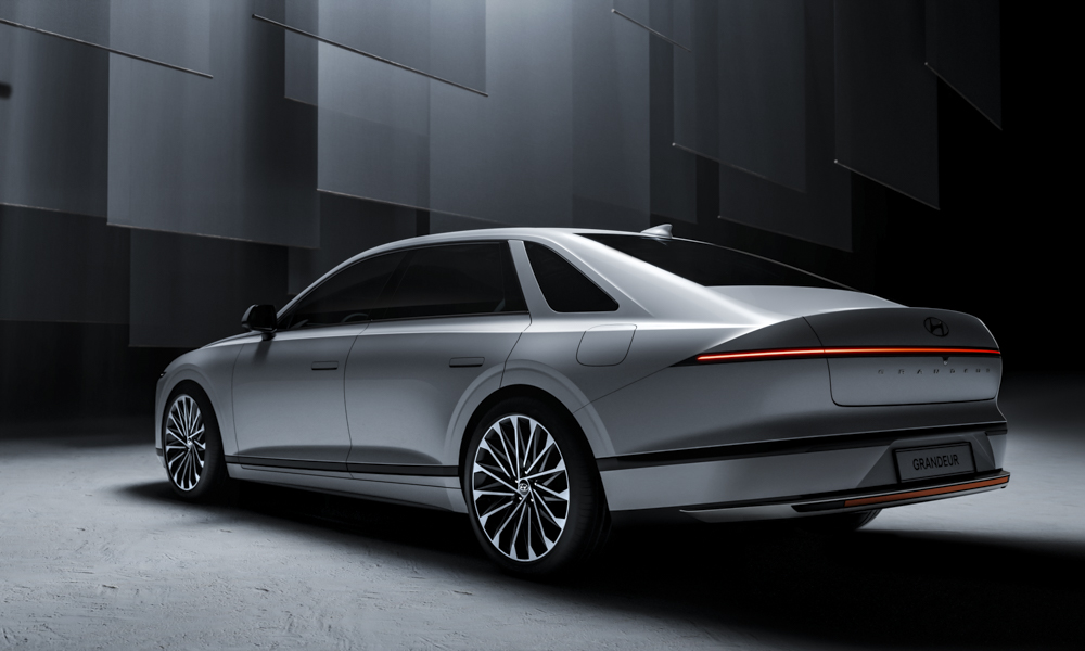
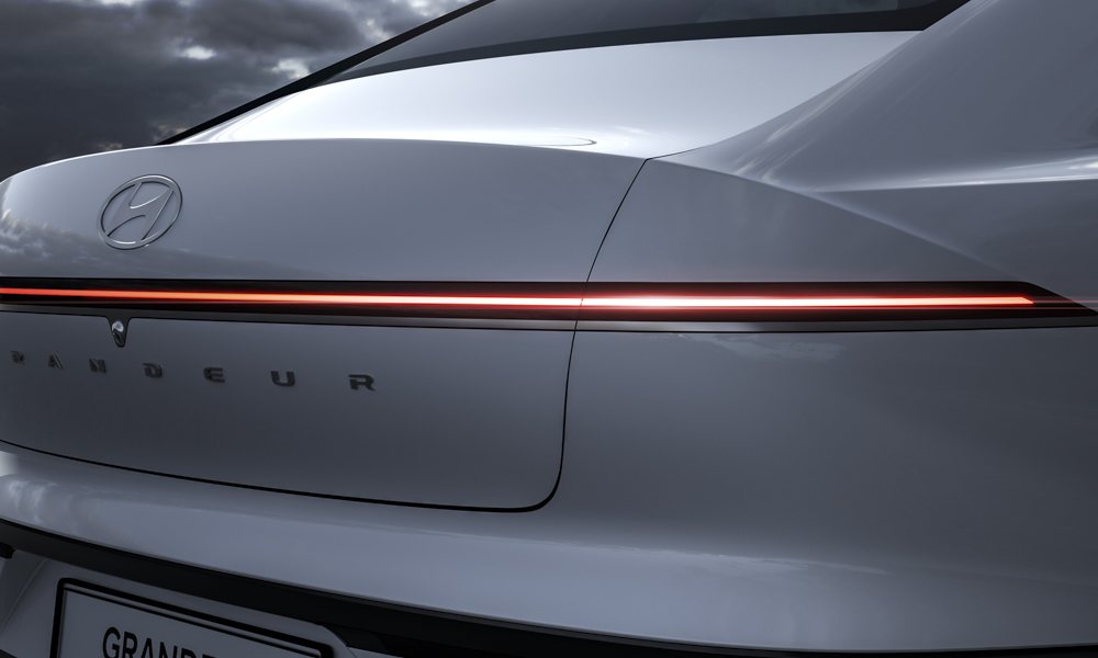
Sitting front and center is Hyundai’s Seamless Horizon Lamp, like the ones you see on the Staria. This spans the wide vehicle’s entire fascia. The rear end follows the front’s design, too. A single lightbar extends from either side and wraps around the corners.
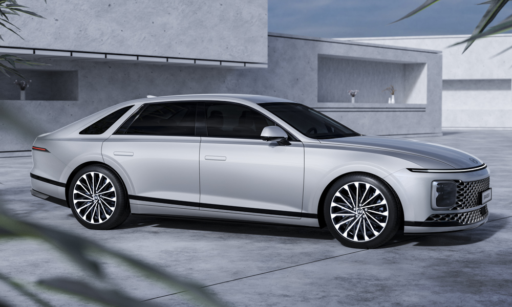
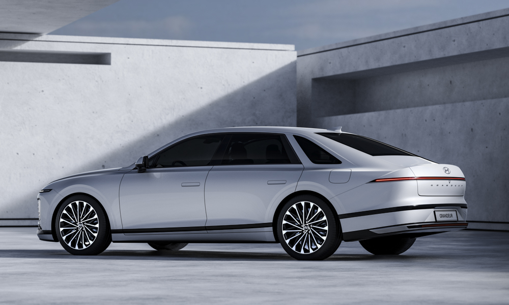
The parametric jewel grille and lighting assembly, just like on most modern Hyundais, are placed at either end of the bumper. The sides feature that elegant look, with a single character line and minimal folds and creases.
To achieve this, the door handles even hide away for a clean, seamless look. The multi-spoke rims and the low-profile tires can be found in all four wheel wells. Finally, there’s a glass panel between the C- and D-pillars, just like the ones seen in the model’s first iteration.
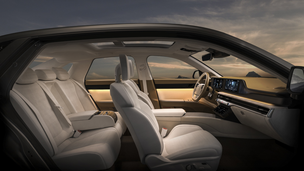
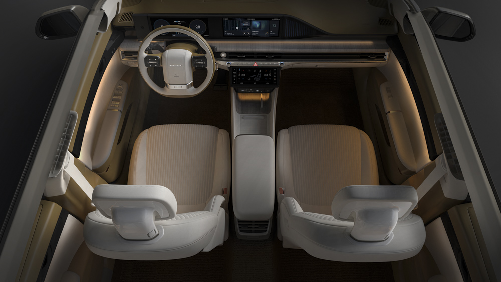
The interior is like a lounge on wheels, with Hyundai’s generous mix of high-quality materials. The digital cluster shows pertinent vehicle information. And this seamlessly fuses with the infotainment screen. There is no shifter in the center console of the car. Instead, this can be found near the new Grandeur’s steering wheel.
There’s one trim that runs from the center console to the passenger side, which also houses the air-conditioning vents. Wraparound ambient lighting sets the mood for an even more relaxing ride. While patterns found on the dashboard and the door trims make the car look authentically Korean. The three-spoke steering wheel is made to look like a two-spoke tiller, as you might see in the old car.
Features, powertrain, and pricing have yet to be revealed as what you see here is just a design preview. But we’re certain that the all-new Grandeur will turn out to be a great vehicle, worthy to be Hyundai’s next flagship automobile.


0 Comments