Remember the new Kia logo from a few months ago? Many people are probably wondering why the revised badge hasn’t appeared on the brand’s latest cars, such as the Stonic and the all-new Carnival. We think that the brand would rather slap its modernized emblem on a car whose (new) design language is just as striking.
Enter the new Kia K8, the sharpest-looking (literally) car to come out of the Seoul-based automaker. The car’s supposed to build on the success of the K7 (also known as the Cadenza) full-size executive sedan that we never got in our market.

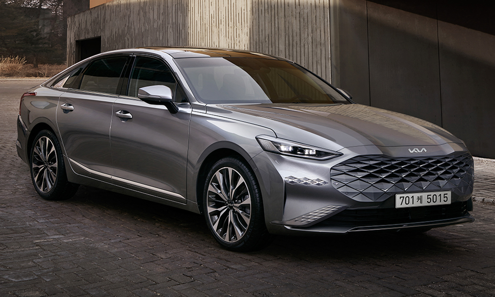
So, on to the K8. The first thing that will definitely catch your eye is the new grille—an evolution of Kia’s signature tiger nose. This is a different take on the current market trend of huge grilles with the diamond pattern slowly merging into the front bumper, making it look as if the front face is just one piece. You can also see the jewel motif extend onto other parts of the bumper and the headlights, too.
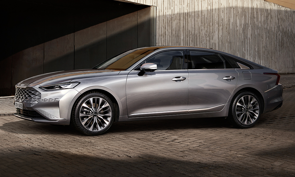
When viewed from the side, the profile is reminiscent of something sportier thanks to the car’s fastback silhouette, all while showing off elegant, swoopy lines to keep things classy. We’re sure that interior room won’t be a problem with the K8 being 5,015mm long, and we expect the ride to be just as cushy as well.
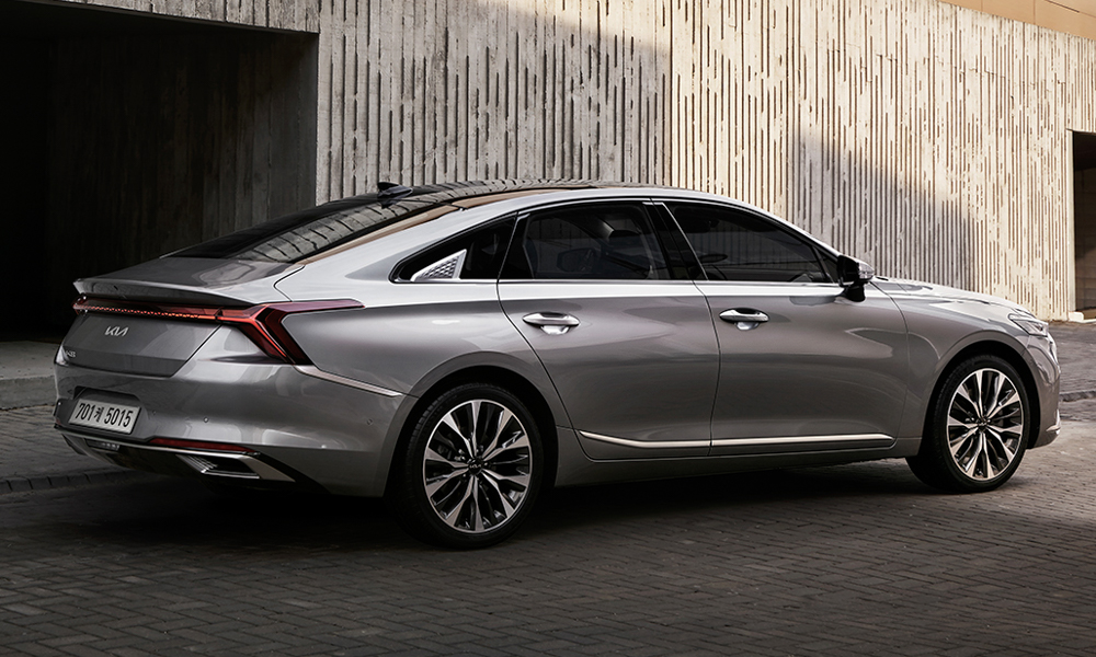
Toward the rear, the fastback terminates into a ducktail spoiler. Underneath, the horizontal taillights that span the car’s entire width maintain the same jewel theme and “hug” the rear fenders by extending out into a K-like shape. The new Kia logo sits below that, with the K8 badge tucked in the kink of the trunk lid.

While Kia hasn’t revealed the car’s performance figures, this dramatic shift in design language is the first step into pushing the brand’s image upmarket. Maybe the next Picanto or the Seltos could look just as good as this in the near future.


0 Comments