We’re in a weird period of time when almost every single car company seems to repackage its image, with rebrands popping up left and right.
Up next on this list is Peugeot, one of the world’s oldest surviving car manufacturers. Hot off the heels of its 210th anniversary, the automaker likely thought that the time was ripe for some change. The press release says that the new logo embodies what the brand means for the past, the present and the future, which is aligned with its move to a more premium market segment and the electrification of its product line under the Stellantis umbrella.

Though unlike other companies, Peugeot’s rebrand seems to have gone for a regal and upmarket look—likely a sign of its upcoming product line. The brand’s outgoing logo is a lion standing upright, with the entire body visible. Having gone through 16 iterations, the emblem now makes way for what seems like a coat of arms. Taking center stage is the lion’s head and mane—a simpler but bolder statement—as well as a thinner typeface for the Peugeot name.
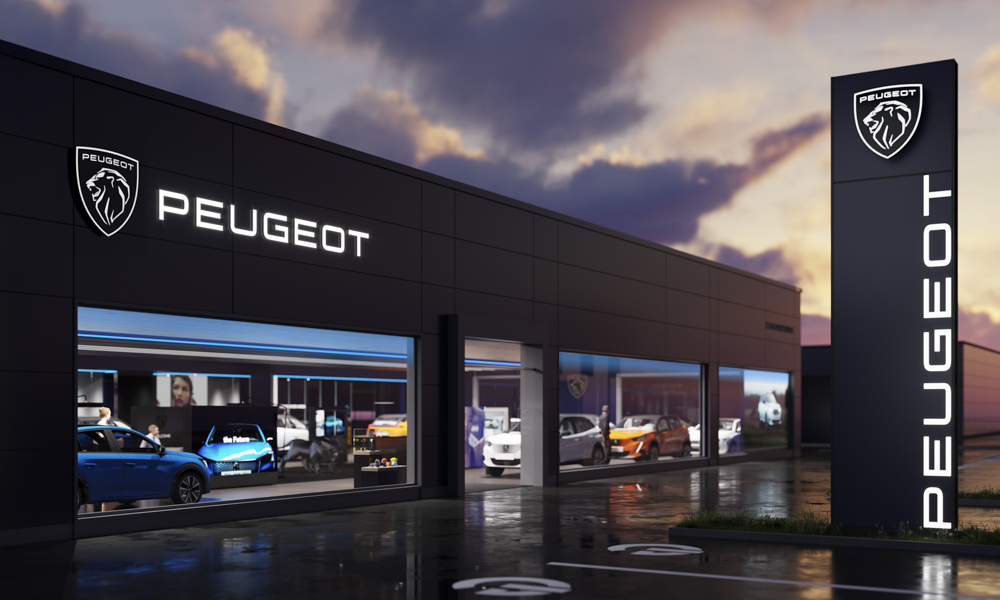
Now, you won’t see the modernized badge appear on current Peugeot models right away. It will initially be used on websites and other promotional materials. The lion’s new face is slated to appear on actual cars this year with the upcoming Peugeot 308 refresh.


0 Comments