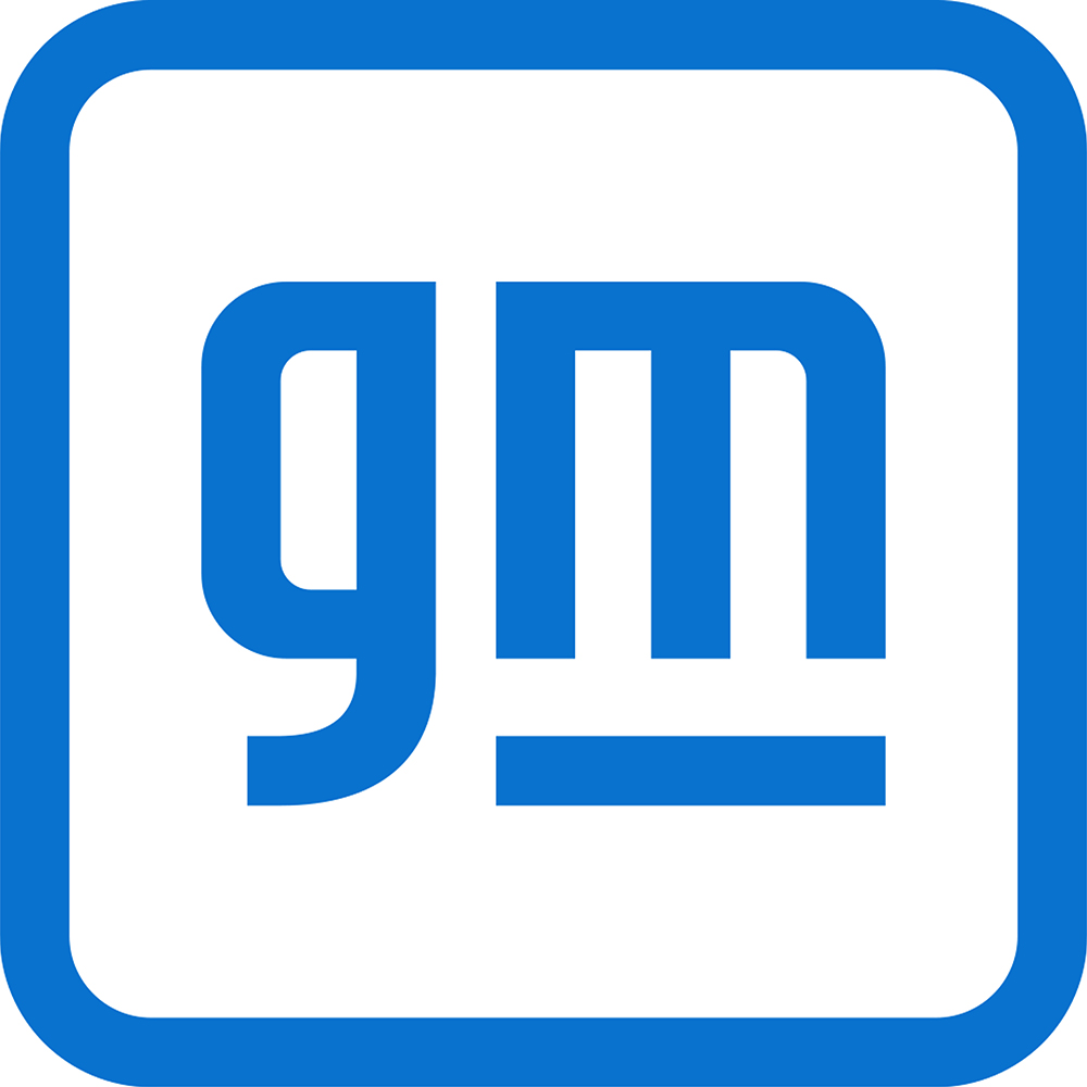
If you haven’t noticed it, automakers are starting to rebrand to reflect their shift to electric vehicles and a digital-first environment. In just the last 10 months, BMW, Nissan and Kia have overhauled their brand logos to mark their product strategy’s metamorphosis. And now, it’s the turn of General Motors to reveal a new brand identity. What perfect timing for an American automaker to roll out a different badge just when its domestic market is facing political and economical turmoil.
In explaining the fresh logo, GM says:
The new GM logo features a color gradient of vibrant blue tones, evoking the clean skies of a zero-emissions future and the energy of the Ultium platform. The rounded edges and lower-case font create a more modern, inclusive feel. The underline of the ‘m’ connects to the previous GM logos as well as visually representing the Ultium platform. And within the negative space of the ‘m’ is a nod to the shape of an electrical plug.

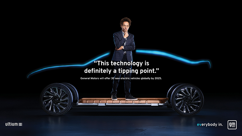
Ultium is the electrification platform that will underpin 30 new EVs in the GM stable from this year up to the end of 2025. It is said to be able to deliver a range of up to 724km on a single full charge, while enabling an acceleration of 100km/h in “as little as three seconds for some models.”
The new logo’s introduction coincides with a new marketing campaign called “Everybody In.” It is meant to invite customers to join “a movement that’s inclusive and accessible.”
“This was a project our team took so personally, not just for ourselves but for the 164,000 employees this logo represents,” the press statement quotes GM Global Industrial Design executive director Sharon Gauci. “At every step, we wanted to be intentional and deliberate because this logo signifies creative and innovative thinking across the global General Motors family.”
The company is launching a new-look website on January 11, 2021. Looks like GM’s immediate future promises to be bright and fruitful.


0 Comments